Project Overview

For this project, I designed new solutions that the Ruter app can implement to improve the user experience of the Ruter app, especially for families who use the app for travel.

My role is to thoroughly examine the current landscape and conduct in-depth research, identifying pain points, gaps and opportunities for improvement. I aim to provide a user-centric and intuitive and accessible platform that meets the needs of our users.


My role
UX/UI Designer
 
Team
1 member
 
Duration
5 weeks, Oct-Dec 2023
 
Tools
Figma, Google Doc, Google Sheets, Miro, Procreate

Problem

Today, many families use the Ruter app and Ruter’s services, but they typically use it individually. If a mother or father is going to work, they often take public transportation, and if a child is going to school, they take the bus. However, when the whole family needs to go somewhere together, they usually opt for the car. There is also a lot of frustration around purchasing tickets for others, and many still use travel cards.

How can we make it easier for families to travel with the Ruter app?


Design Thinking

For this design challenge, I will use the Design Thinking approach to prioritize customer needs and create innovative solutions.

STAGE 1: EMPATHIZE

Research goals

The very first step of my design process was to capture my own existing ideas, knowledge and understanding of the problem space and defined following research goals: 

 
Overall research goals

The research aims to explore and propose enhancements to the Ruter app, with the goal of facilitating a more seamless and user-friendly travel experience for families.


Identify target groups and their requirements:
  • Who are the primary users within these families, and what are their unique requirements and preferences when using the Ruter app?


Competitive Differentiation:
  • Where do competitors stand out on the competitive landscape and how do other transportation apps cater to families.
  • How can Ruter differentiate itself by offering unique features or improving existing ones that address the specific needs and challenges faced by families?
User Experience, Situational and Root Cause Analysis of Challenges:
  • What are the current challenges and obstacles that families face when using Ruter’s app?
  • Why do they experience challenges with the app and how do the challenges happen? (what is the reason why they experience the obstacle and what happens before, during and after.)
  • When do families frequently use the Ruter app, and are these certain times or situations where they encounter more challenges or frustrations?
Feature Assessment and Enhancement:
  • What are the most favored features of the Ruter app by users, particularly within family contexts.
  • What are the user preferences and reasons behind their preferences?
  • How can we identify areas for improvement and new features that could enhance the overall user experience for families.


Research methods

To identify opportunities for improving the Ruter app and ensuring a smoother, more user-friendly travel experience for families, I’ve utilized a combination of secondary and primary research methods. 


Secondary research

As part of the quantitative research, I conducted a literature review to understand existing research on the topic. Additionally, I used desk research by accessing Ruter’s internal system, called Siebel. 

Primary research

To understand how users interact with the app, their experiences and needs, I will use qualitative research methods such as competitive analysis and interviews. This approach helps uncover the reasons behind user actions and their guiding principles.

1. Literature review

The purpose of a literature review is to collect and examine information from various sources to gain insight into the research objectives.I also gathered data from customer inquiries in Ruter’s CRM system, known as Siebel, and studied the customers’ complaints about the app (desk research).

This gave me a better understanding of the problems and situations faced by the target group.

Link to literature review


Demographics: Diverse user base with changing travel patterns and preferences.

Growth: Increase in logged-in users in the Ruter app from under 35% to almost 65%

Motivation: Evolving user needs for seamless and flexible travel experiences

Challenges: Security concerns regarding children using the app, technical issues and design challenges.

2. Interview

I interviewed four participants, including three family members with children and one without. The purpose was to understand the participants’ experiences, problems and needs related to the app, as well as their typical use of the app. I wrote a script to help me through the interview session, to make sure I get all the information I need.

Link to Script

The data was captured on audio and notes taken along the way. The transcript and observation of the interviews were captured in Google Sheets.

Link to interview data


This gave me a better understanding of the problems and situations faced by the target group.

Link to literature review

3. Competition Analysis

A competition analysis was conducted to understand the market space and identify their successes and their challenges. I examined the features of travel apps from both Norwegian and international competitors in the market. This analysis played a crucial role in identifying user pain points and areas where our product fell short, offering valuable insights for our product development.

Link to Competition analysis (Swot & Feature Analysis)


Affinity Mapping

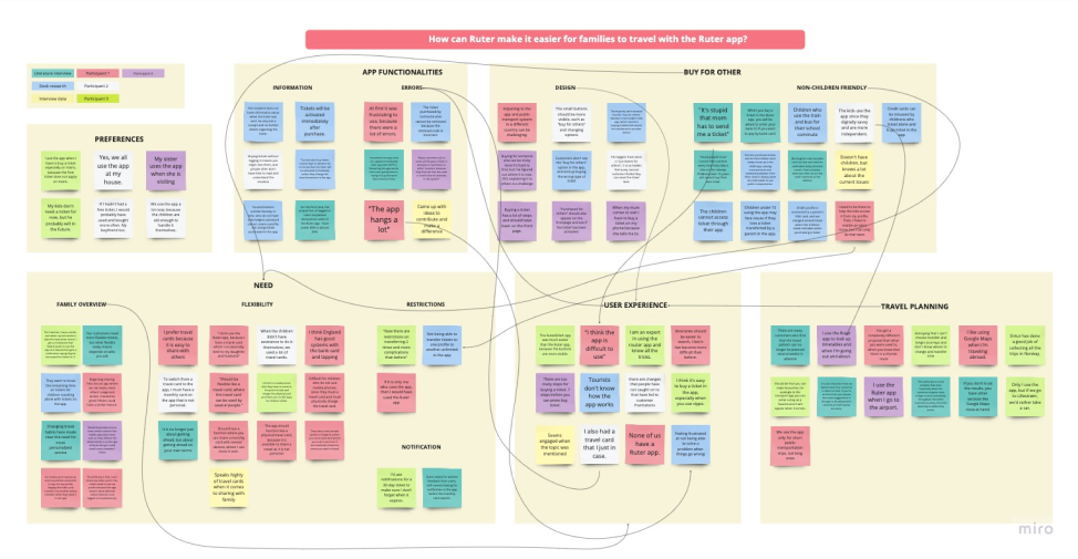
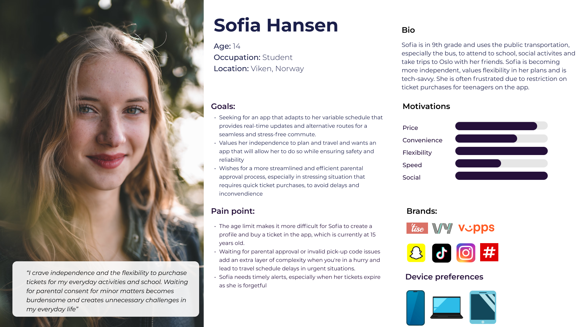
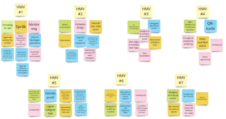
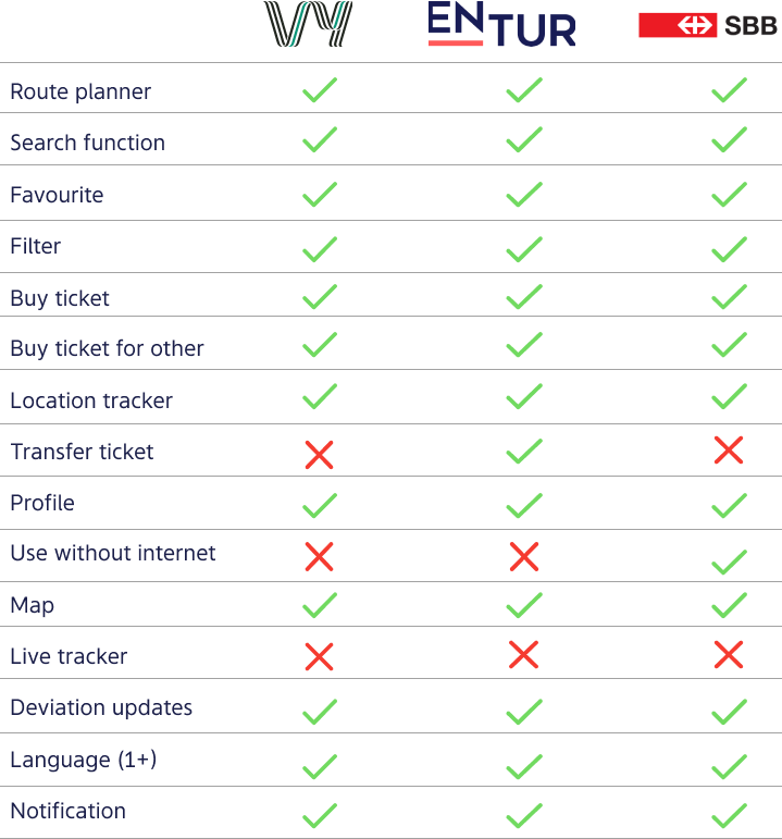
With the findings from the spreadsheet, I analyzed the data using affinity mapping to identify common themes.

Link to spreadsheet: Fact sheet
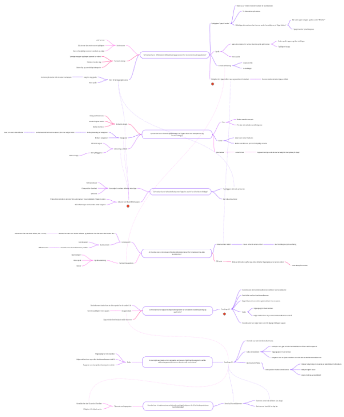
Link to affinity mapping: Miro-session

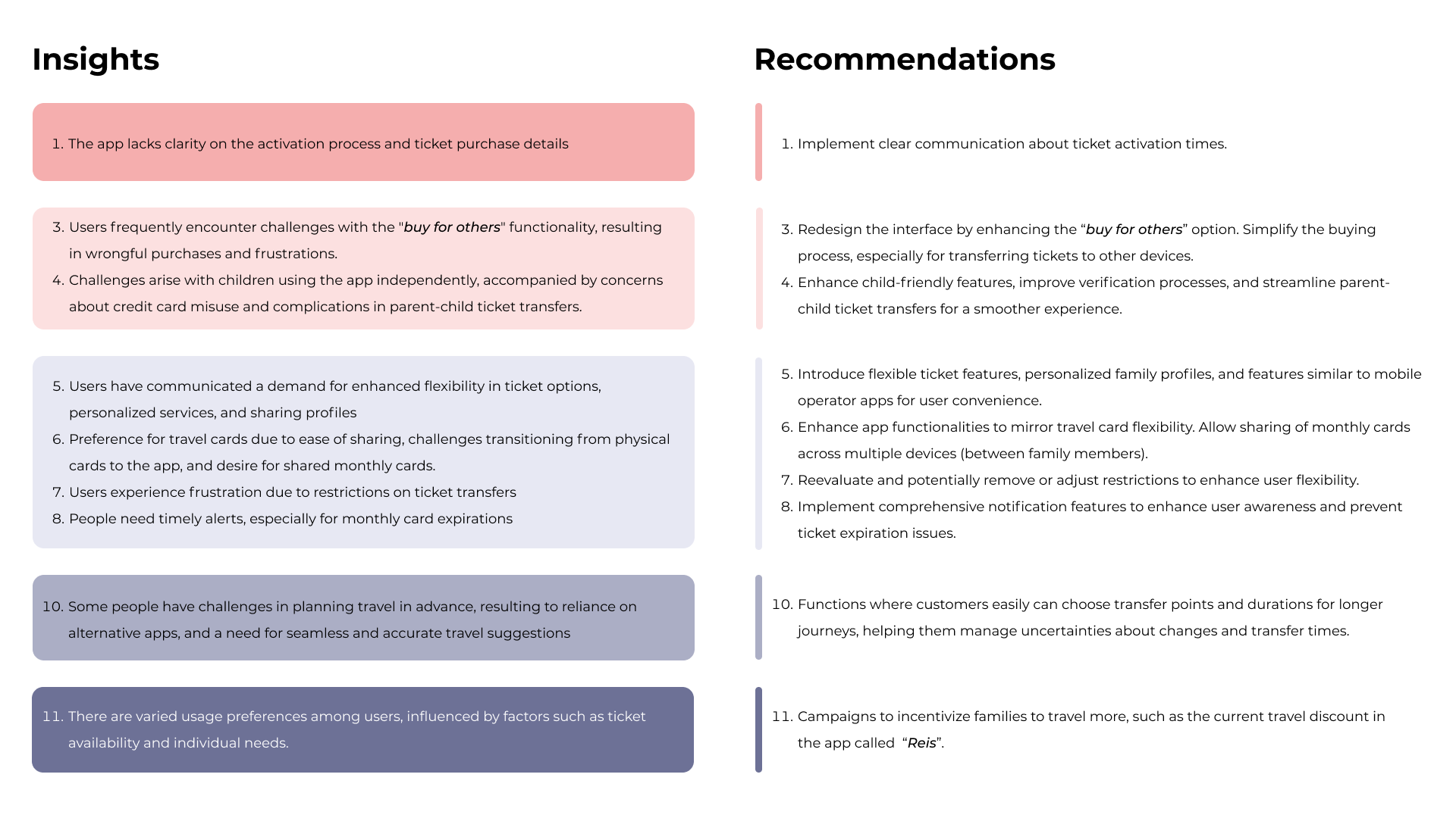
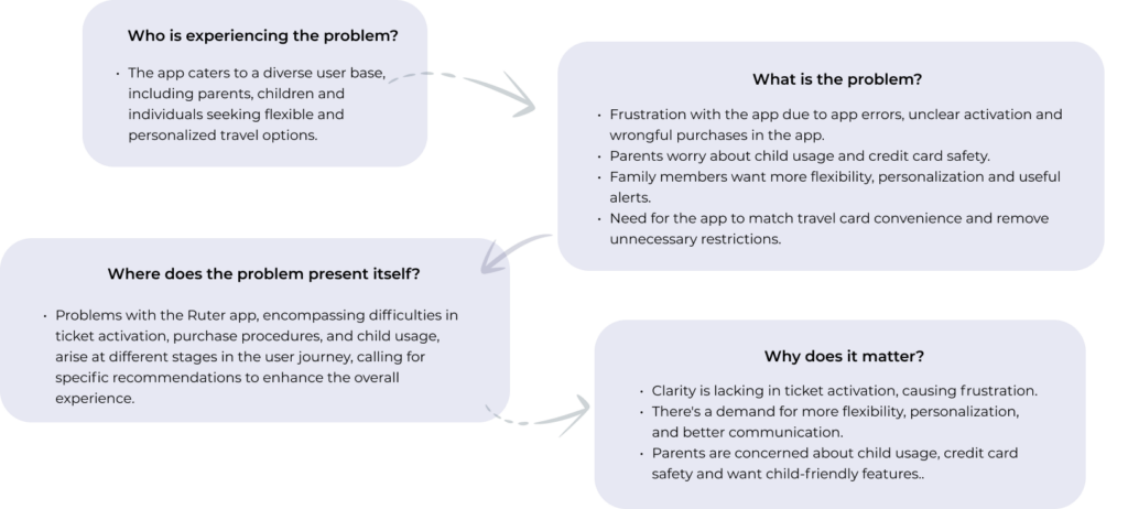
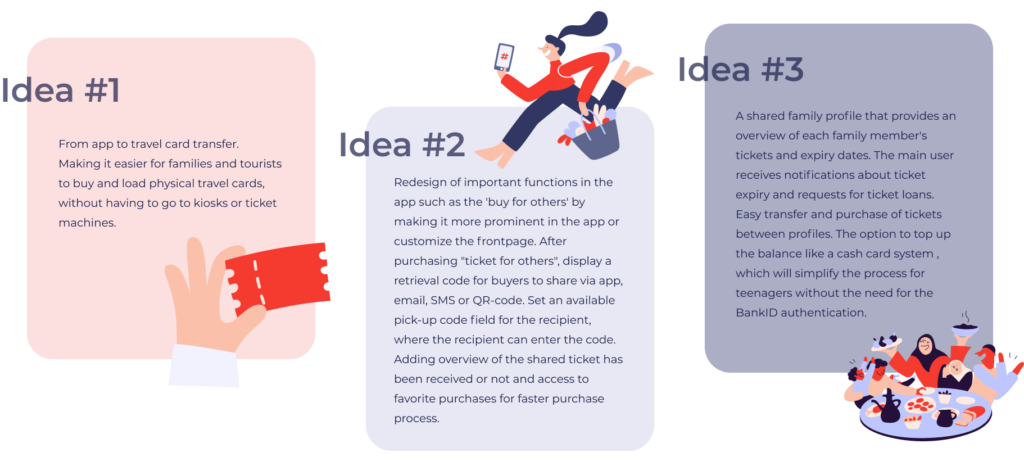
I synthesized these themes to extract meaningfull insights.

Link to spreadsheet: Facts, insights & recommendation

STAGE 2: DEFINE

The 4 W's

With the help from the 4 W’s technique, we can formulate a meaningful problem statement by focusing on the user’s needs and pain points.


Problem Statement

Persona

Based on insights gathered during the research phase, I created two personas – an imaginary user archetype – to ensure that the design process revolves around the needs of the target audience.

The primary one centers on the ticket buyer, while the secondary persona is geared towards the ticket recipient.


User scenario

The user scenarios presented here shows two specific events showing the primary and secondary persona’s behavior toward and needs concerning the Ruter app. 

Primary Scenario

1. Anders suddenly remembers at work that one of the children’s monthly cards will expire in 1 hour and worries that his 7-year old son will take the bus from school to home without a valid ticket.

2. Anders suddenly remembers at work that one of the children’s monthly cards will expire in 1 hour and worries that his 7-year old son will take the bus from school to home without a valid ticket.

3. He buys a new 30-day ticket for his son, and sends to his son’s profile.

4. He is worried that his son won’t claim the ticket on time, before taking the bus. Anders has to wait for his son finishing school in order to call him and notify him about the ticket.


5. Anders finds this process stressful, as it impacts his work and requires him to frequently check the time to see if his son has finished school. He wishes for a notification to know whether the ticket has been claimed or not.


Secondary Scenario

1. Sofia is discussing with some friends about taking a quick trip to Oslo after school. She needs a ticket and is not old enough to buy a ticket in the Ruter App, and there is no kiosk nearby that sells physical tickets either. 

2. Sofia calls her mother and requests her to buy a ticket on her behalf.

3. Sofia’s mother purchases the ticket for Sofia and sends to her profile, ensuring that Sofia it is available for her journey.

4. Sofia’s mother call Sofia, to confirm that Sofia has received the ticket on her profile. 

5. She activates the ticket, but finds the ticketing process in the app exhausting, as it requires unnecessary back-and-forth communication with the parents for a seemingly simple task. 

STAGE 2: IDEATION

How might we

I created a list of “How Might We” questions based on the problem statement for my ideation workshop session. This helped me to come up with creative solutions and ideas to tackle the problem statement effectively.  


Ideation Workshop

I conducted an ideation workshop with some friends and family to generate ideas and help me develop a range of possibilities. However, I had to finalize the top solution on my own by referring back to the research and looking at the needs of the user group. 

For the workshop, I decided to use divergent thinking techniques such as brainstorming mind mapping and sketch storming and convergent thinking techniques such as dot-voting to generate ideas. 

Link to ideation workshop: Miro-session


1. Brainstorming

By using brainstorming we generate ideas and solutions to the «how can we» questions. With this ideation technique there is no pressure to come up with a good idea, as «there are no bad ideas«. 


2. Mindmapping

The ideas generated from brainstorming were organized into a mind map to further develop and build upon them.

The mind map created in the Miro board showed all the different ideas clearly. I then used the dot-voting process to select ideas that best solved the problem statement and were feasible to execute. I ended up with 3 different ideas.


3. Sketch-storming

I did this step alone where I started sketching out what these three ideas would look like and how they would work. After thoroughly reviewing the sketches and discussing the ideas with my mentor at Ruter, I was advised to choose the solution that could better solve the problem and that was not outside my scope of work.

Another piece of advice I got was that some of my ideas might be complicated considering the scope of the project and the time I had available.

Link to Sketches 


Top 3 ideas

The top 3 ideas generated in the ideation sessions were:

Top selected idea

I chose idea #2 as it addresses one of the main concerns of the target audience and provides the best solution without requiring the creation of an entirely new system or legal involvement.

A redesign of the main ticket page could improve the app’s usability for individuals, family members and tourists, which reduces wrong purchases. Once the basic function is in place, consideration of idea 1 or 2 can be implemented later.

Information Architecture

In the ideation session, I chose to enhance the app’s user experience by redesigning certain functions, particularly within the ticket tab. I integrated changes into the existing structure of the Ruter app to create a clear and user-friendly layout, making it easy for users to find and navigate the information they need.

As of today, the app’s information structure varies based on whether you have a profile. I’ve prioritized the inclusion of the profile login and will concentrate specifically on the ticket section. After logging in, the app automatically directs users to the ‘travel’ page. Its current design reopens the last-used page upon closing. Given this complexity, I’ve been advised to narrow my focus to the ticket section

Link to Information Architecture


Task Flow

The task flow illustrates the steps users take to achieve a specific goal. It helps us comprehend and map the user’s journey, providing insights into their interactions, decisions, and the sequential actions needed for completing a task.

1. Buy a ticket for other profile
2. Check status of all the purchased tickets

User flow

The user flow shows a comprehensive insight into what functionalities the Ruter app needs to achieve the user’s needs. The user flow was used to help me figure out what features and pages I needed to add or tweak to help users complete their tasks easily. 

  1. Buy a ticket for other profile
  2. Check status of all the purchased tickets
  3. Buy a pre-saved ticket from favourite


Key functionalities and requirements

I have carried out a content audit to ensure that all the crucial aspects of the development of the design solution have been taken care of. This has been done by describing the app in terms of data, technical, functional, contextual and experience requirements. By understanding the user’s needs in terms of simple and flexible ticketing process, I have gained a deeper understanding of what it takes to create with the Ruter app and to design for inclusion.

Link to spreadsheet: Key functionalities and requirements


STAGE 4: PROTOTYPING

Sketches

I began the design process with sketces on paper in order to figure out what works best. I’ve sketched out low-fidelity wireframes from a user profile perspective.

Link to sketches 


Low-med wireframes

To better understand my ideas, I created low-med fidelity wireframes. This helps to see how users will navigate, what content to include, and how it should be organized. The design is divided into two parts: the first part illustrates the buyer’s perspective, while the second part concentrates on the recipient of a ticket.

Link to Wireflow

Persuasive Design

When developing the low-fidelity design, I considered Jakob Nielsen’s 10 Usability Heuristics for User Interaction Design to ensure good usability and with accessibility in mind. Additionally, I integrated Persuasive Design elements to enhance the app’s engagement for users.

Link to Low-med prototype


Behavioral design
The router app’s user experience is crucial. It should be very user-friendly, allowing tasks to be performed quickly with minimal steps, achieved through clear structure, navigation and item names.


The visceral design
The first impression we want to create for users of the app is safety and reliability. This will be achieved through a clean and engaging user interface, which motivates users to stay and use the Ruter app instead of choosing a flexible travel card or switching to a competitor.


Reflective design
The users reflection of use before, during and after of the app. The motivation and feeling of accomplishment are reflective reactions we want to evoke among the users in order to make them to become frequent users of the app.


Usability Testing 1

In order to test out my ideas were useful and intuitve for our users, I conducted a usability test in-person. The goal was to identify what worked well, what didn’t, and gather user feedback on the new changes. The feedback identifies areas for improvement and ensures the effectivnes of design solutions before implementation.

Link to Usability Testing 1 Report


Test goals

  • How easy it is to navigate through the application?
  • Does the app streamline the ticket purchase process by clearly identifying the ticket recipient?
  • Is the information box informative and easy to understand?
  • Is the setup for purchasing tickets more user-friendly compared to the current version
  • Are more buttons needed in the ticket tab
  • Can users easily find the status of the tickets they have purchased?
  • Can the users add a Ruter contact with without any issues?
  • Is the “transfer ticket” feature convenient and easy to use?

Tasks

  • Part 1: From a purchaser view
  • Buy a ticket to another profile (1 Singleticket for Child, zone 1 & 2V) that will be sent later
  • Choose to send the ticket by adding a new Ruter contact
  • Check the status of the sent ticket
  • Send pre-saved ticket to Child’s name

Part 2: From a receiver point of view

  • Claim a ticket
  • Transfer an active ticket to another Ruter profile


Results from usability testing 1

Participants shared their thoughts while doing tasks (Concurrent Think Aloud) and shared their experiences later (Retrospective Probing). I asked about their preferences to make things easier and collected their feedback. I then organized an Affinity Mapping session to understand insights and suggestions. The new layout and options were well received, making the user experience much easier for participants.

Suggestion for iteration:

  • Consider renaming or providing clear explanations for terms like “favorites”
  • Explore ways to make the «my ticket» section even more prominent for users.
  • Change the layout of share contacts and button
  • Provide clearer instructions for adding Ruter contacts
  • Enhance the visibility and clarity of information boxes to ensure users notice and understand them.
  • Maintain the list format and user-friendly layout.

Iteration

Based on the valuable insights and suggested iterations from the first round of user testing, I applied this to the create the high fidelity wireframes.

Moodboard

After the Usability test 1, I looked for inspirations on pinterest and created a board, which I used as a moodboard for creaeting the high fidelity wireframes. 

Design system

For the high-fidelity I used Ruter’s design system. Their design manual is open to everyone and can be accessed here. Ruter Design System follows the WCAG 2.0 AA standard and uses guidelines from the Agency for Public Management and eGovernment ([Difi]). 

High-fidelity Wireframes

High-Fidelity

I created a High-Fidelity Prototype in Figma. Since the Ruter app exclusively targets mobile platforms, the prototype is designed specifically for mobile screens.

Link to High-fidelity prototype in Figma 


Usability Testing 2

After creating the high-fidelity prototype, I conducted a second round of usability testing. The goal of the usability testing was the same as the first usability testing, but I wanted to see if there were more improvements that could be made.This usability test was carried out with 3 participants who fit the user persona.

Link to Usability Testing 2


Test goals

  • How easy it is to navigate through the application?
  • Does the app streamline the ticket purchase process by clearly identifying the ticket recipient?
  • Is the information box informative and easy to understand?
  • Is the setup for purchasing tickets more user-friendly compared to the current version?
  • Are more buttons needed in the ticket tab?
  • Can users easily find the status of the tickets they have purchased?
  • Can the users add a Ruter contact with without any issues?
  • Is the “transfer ticket” feature convenient and easy to use?
  •  
 

Tasks

Part 1: From a purchaser view

  • Buy a ticket to another profile (1 Singleticket for Child, zone 1 & 2V) that will be sent later
  • Choose to send the ticket to Ingrid
  • Check the status of the sent ticket
  • Send pre-saved ticket to Theo

Part 2: From a receiver point of view

  • Claim a ticket
  • Transfer an active ticket to another Ruter profile


Results from usability testing 2

Just like the first round of user testing, participants spoke their thoughts while doing tasks (Concurrent Think Aloud) and shared their experiences later (Retrospective Probing). Their feedback on suggestions and preferences was collected and used in the Affinity Mapping session to understand insights and suggestions that can be implemented to improve the app. The new intuitive design was well received and all the participants came up with good solutions this round as well. 

Suggestion for iteration:

  • Consider the placement of “transfer” ticket placement
  • Continue exploring and potentially enhancing the zone map feature based on its positive reception
  • Make information boxes more noticeable or consider alternative ways to present important information.
  • Improve the list format to prevent confusion around the first box on the «buy ticket» page
  • Continue to maintain and build upon the intuitive design aspects.
  • Consider merging some of the buttons with other mergers, such as «buy for others» where «pre-saved contact suggestions» comes at the start
 

Recommendation

Based on the valuable insights and suggested iterations from the second round of user testing, I made some changes that I believe will improve the user-experience. 

What is next?

The usability testing round 2 provided with valuable insights and recommendation that lead to changing some elements in the high-fidelity wireframes. The next step is to implement these changes to the prototype and conduct another round of usability testing to check if these changes will improve the user-experience and make it more intuitive for the users. I believe that the new adjustments will reduce confusion and enhance intuitiveness.

Next step

  • Conduct another usability test with the updated prototype and with new tasks to check user intuitiveness.
  • Gather insights from the test results and use the insights to iterate on the prototype and keep repeating this cycle to improve the overall user experience.
  • Update the design system.
  • Consider the use of blue text boxes versus white boxes for WCAG compliance.
  • Explore the possibility of implementing the first idea from the ideation session (transfer from app to physical card)
  • Create improvements in dark mode, in order to improve accessibility.
 

Conclusion

This case study shows how I applied the Design Thinking process to address real-life problems withing a limited timeframe. Instead of focusing on the entire app, I concentrated on a select few features that were necessary to meet the needs of both locals and tourists. This was very difficult as the app is already structured differently for consumers with and without a profile and users with a foreign number. I hope my ideas are considered for future development.